The Power of Data Visualization
 I've posted a few times on the fascinating world of information visualization (thinking machines, zipcode fun, flight patterns, google eyed) but I just came across an amazing project by Jesse Bachman titled "Death and Taxes: A visual look at where your tax dollars go" which depicts a somewhat disturbing chart on how the US government spends it budget.
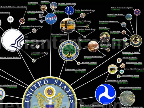
I'm the type that has never bothered to read the stacks of written forms showing this information and am pretty unaware of how our taxes are spent, but being a visualizer as I am, I've quickly grasped how taxes in the US are distributed though this incredible image. Anyone can understand this chart, and that is the power of information visualization. The chart will surely raise many eyebrows and questions, so have a look at this article, or navigate into the FULL SIZED chart here.
posted by tango! at
Sunday, July 09, 2006 | permalink
![]()


0 Comments:
Post a Comment
<< Home