url switch!
Change bookmarks, feeds, favorites, to the new URL:
http://www.designverb.com/
 Seems like Sony is masterminding yet another colorful commerical after their famous bouncing balls commerical, but this time, their using colored paint balls, and TONS of it:
 70,000 litres of paint
358 single bottle bombs
33 sextuple air cluster bombs
22 Triple hung cluster bombs
268 mortars
33 Triple Mortars
22 Double mortars
358 meters of weld
330 meters of steel pipe
57 km of copper wire
Sounds like fun:Sony Bravia Advert
update: an interview with David Patton on the making of the video, on PSFK’s IF here. (thanks jeff)
 Siggraph 2006 kicked off today with some great animations and a peek at some emerging art and interactive technologies. In short, Siggraph is a super hub conference of computer graphic animations, interactive techniques, and lots of computer related robotic tools and applications. It’s where technology meets creativity. For a glimpse at what Siggraph has to offer, check out these two video briefs: Art Gallery and Emerging Technologies.I watched a bunch of great animations today and had a peek at the galleries. As usual, I was asking a bunch of questions as these kind of conferences are more about what’s possible, rather than whats desirable. More Pictures and thoughts here.
 I was browsing for some Honest Tea at Wholefoods and stumbled across Inko’s Lychee flavored white tea instead. I’m a sucker for Lychee, hence gravitated towards the bottle, made sure it wasn’t one of those over flavored or sugar saturated ripoffs, then read the rest of the info. Apparently this is the ONLY white ice tea available in the market, which is also one of the most rare tea leaves in the world. There are tons of health bennies you can read about on their webpage, but I’m just going to say this drink rocked! Not to sugary, very crispy, and a delightful satisfying tea flavor with a zest of lychee goodness. Hopefully I can get my hands on a case of these drinks to pass around to friends at my next gathering.
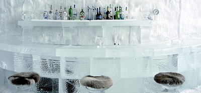 Did you ever think those ice hotels in James Bond flicks were real? Well, the answer is yes, and yes for many more unusual adventure-some hotel destinations throughout the world. Would you like to stay in a Cave tonight, perhaps stay up in the trees, better yet closer to the woodpeckers, a popular night in a Freighter Plane, a hotel that you must scuba dive underwater to enter, or would you just like your classic ice hotels. I’ll give the ice and treehouse a try someday, but for now, I’ll stick to the comfy basic rooms that probably suit my budget for the time being, though the polished up fancy ones are always nice to lounge in.
 Call it a magazine, call it a bottle of water, or just plain call it a refreshing idea in between. "ilove" is the first gossip magazine for women on a bottle of water. Each month several 32 page issues are attached to bottles which allows women a quick update on several topics while they enjoy their beverage....it's somewhat like a daily blog on a bottle of water. Their hopes are to make these monthly issues weekly, hence, 6+ issues a week, with a version targeting the male audience soon.
 Bong Vodka has just launched a sensational series of artist bottles in collaboration with several artist. These limited edition bottles and graphic boxes will be available towards the end of August in select cities. If you would like to get involved, and perhaps strut your artistic abilities on these beautiful bottles, head over to Spirit Of The Brand and get involved! Their site has a pretty sweet music cast as well.
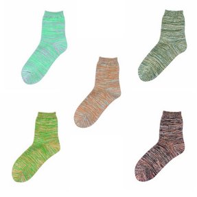 I’ve been rockin these recycled yarn MUJI socks for a few weeks now and have to say they are great! In fact, after testing out the first set, I went back to the store and bought another set! My friends have bought up to three sets! They are stylish, comfortable, fun, and colorful. The colors are somewhat odd for some, but that's what makes them fantastic! From a vibrant apple green to a purple haze and a busy blue fuze. If your looking to jazz up your sock collection, head on over to your local MUJI store and get a fresh pair of them...or, get them online here!
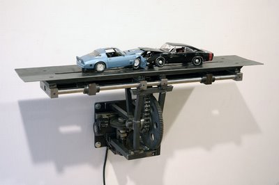 Here's a cool project by artist Jonathan Schipper dipicting two cars slowly crashing into each other over the course of a month. There's also a full sized version yet to be built. This reminds me of Arthur Gansons project "Machine with Concrete" (on display at the MIT Museum) which pushes a piece of concrete an inch or something over the course of a few thousand years, hence, you really can't see it moving though the gears are cranking right in front of you.
 I grabbed a pack of gum while waiting in line at Target the other day. I threw it in my bag and thought nothing of it until needed. While picking up a friend for dinner, I whipped out the 12 pack of gum for a quick zest of fresh breath. As I slid the foiled goodness out of the packaging my eyes glazed in confusion and utter surprise; there was no gum in 9 of the 12 foiled slots! I've been robbed, ripped off, denied! Did someone pop the gum out and slide the package back in the shelf? In further investigation, the sealed foil was untampered. This was a factory malfunction, a really bad quality control computer or person, or something gone wrong!
 My phone alarm sounded off this morning and as usual it turned itself off after 30 seconds, while the outside screen still flashed “alarm”. Now I’m not sure about anyone else, but I’d usually just sleep through this or being the sleepyhead that I am, I’d probably just smile in my sleep knowing that the buggy noise would turn off within a few seconds which has happend. Now, I’m not sure who decided to have the sound turn off automatically before I even touched the phone, but from my perspective, this is broken, which also reminds me of a wonderful website, THIS IS BROKEN.com.
 First there were those t-shirts, hats, golf balls, and other objects that you could embed your name into and give as great gifts. Then came the ipods with the etched personalizations. Then came the “create it yourself” trend in making your own designs and looks in products. Video games also allowed people to map their own faces onto basketball players, though they looked like contorted lego heads. Now comes a rather interesting twist to the world of MP3’s with the experimental trial run with artist Jessica Simpson’s “Your Name, Your Song”. You pay $1.99 and get your very own personalized version of Jessicas smash hit single “A public Affair” featuring you!(and the other thousand people that have your name)
 It’s here! Tesla Motors just announced their new all electronics sports car due to hit the market next year. I’m not the type that posts on cars much, but for an all electronics car that is virtually silent and makes no pollution, I’m all game for it. I’d write more about it, but WIRED has a short article to chow down on. Also, there’s a brief video on youtube here. Oooo.. the smart car I posted about earlier also announced an electronic version!
 During my visit to Chicago, I got to experience Millennium Park. One project that stood out was Crown Fountain by Jaume Plensa. You can read more about it at their site, but what I want to point out was how happy, joyful, and excited kids were to interact with, play, and to get wet at this particular piece. Kids would run around, line up, learn the art pieces routine. At times, kids would start talking to the projected faces, telling them to hurry up(get them wet). Kids lined up in anticipation right where the fountain would hit. The projected images would hint and tease onlookers of the next event. Once the water started to spill outwards, kids would scream, run around, smile, and be in such delight. One thing I noticed however was that the only people doing all of this were kids… parents and others would just watch, with an occasional couple treading through the water. Why were there only kids having such fun. Why do we as humans lose our sense of play as we age. I’m not saying all of us lose this amazing ability to play with anything, but many do.
 I briefly made a trip out to Chicago and finally got to check out the well known and fantastic Millennium Park which kept me entertained for a good evening. I'll post more about the trip, but for now, some bullets:
 I ran into some moments this few week where my perception and respect for certain places or things lost some points. I'll site a few here briefly:
 I love the internet. If ya need a good laugh, check out this drunk hamsters video here. Enjoy!
 I love it when products add that lil extra something to refreshen themselves after some time. In this instant, I'm talking about some smart and whimsical instructional graphics on the inside of Wrangler Jeans, which depict the proper way to slip into that special pair of jeans. (via ettf, more examples there)
 I was talking to a friend the other day questioning if good design cost more money. Well, in many cases it does, or helps, but in this post I'd like to show you that it does not have to with a book by Paola Antonelli, design curator of New York's Museum of Modern Art. The book, "Humble Masterpieces" sites some very simple everyday objects that most of us take for granted such as the post-it note, paper clip, lego blocks, and q-tip. Everyone can buy these products, and pretty much everyone has. Is it good design? You bet damn right it is! So damn good that everyone uses them. Some may argue that these objects are not designed, and moreso inventions, but in my world of design, inventing products that millions of people need and want because it solves a problem is great design. Now, there is the question if mass consumers and affordance equals a successful design, but I'll post about that later on as it is a blurry topic to cover, though I'll say yes it is for now. Anyhow, if your interested in this book, here's a short article on it or you can buy it at Amazon. Enjoy!
 The ingenious inventor and designer James Dyson has just announced a new school that will open doors to young minds in September 2008 in Bath England. "The Dyson School of Design Innovation: UKÂs first National Centre of Excellence for design, engineering, and enterprise will be the first of it's kind to encourage and facilitate Britain's next generation of engineers, designers, inventors, and entrepreneurs. I've got a soft spot for engaging and introducing kids to the wonderful world of innovation and design especially after seeing Sir Ken Robinson speak about how creativityy should be just as important as literacy" in today's world. I was never exposed to design until college and have high hopes for kids being exposed to the creative, goofy, and energizing world of design from a young age. If I learned and knew about making prototypes, models, sketching, and design in high school....my goosh, that would rock!
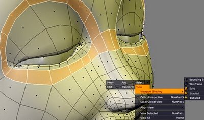 Elephant's Dream is the world's first open source movie created with Blender, a completely open source 3D modeling animation program, so, if your complaining about expensive 3D software, you can get this one completely free. As for the Cinema portion of the movie, all the production files are available online for FREE (Whoohoo!)- free for interpretation and manipulation. Re-edited versions of the film are already starting to appear on the web.
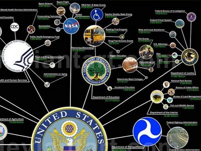 I've posted a few times on the fascinating world of information visualization (thinking machines, zipcode fun, flight patterns, google eyed) but I just came across an amazing project by Jesse Bachman titled "Death and Taxes: A visual look at where your tax dollars go" which depicts a somewhat disturbing chart on how the US government spends it budget.
 Pecha Kucha Nights is an event gathering young designers to meet, network, and quickly show their work in public spaces. The catch to the presentations is that each of the dozen+ presenters is allowed 20 slides and 20 seconds each, which is a recipe for a lively, enthusiastic, concise presentation. The idea for pecha kucha (which is Japanese for the sound of conversation) started in Japan in 2003 and has quickly formed groups in key cities around the world.
 Not to long ago, I posted about BrandVerbs including google, and as of of yesterday Googles been officially defined as a verb and added into the 11th edition of the Merriam-Webster Collegiate Dictionary. I'd expect Google and other such brand names to be defined in dictionaries such as Wikipedia, but for Websters official dictionary came to me at a bit of a surprise. Imagine if yahoo, webcrawler, or alta vista got defined. I would'nt be saying "I'll Google it", it would be "I'll alta vista that", hehe. Anyhow, I'm surprised they didn't define google as: the digital brain.. as well, it's seriously half my brain these digital days, and my quick spell checker (ya type in a word your not sure is spelled correctly, and google suggest a spell change..beats typing in dictionary.com, though you can use their tool bar as well)
 Just when I thought there were no more inventive ideas in presenting tea bags comes adagios blooming tea bag, which, as the title says, blooms right before your eyes as you pour some hot water into a clear cup of boiling water. I've yet to actully witness this magic unfold, but I could imagine the delightful little touch and smile it gives to the tasty tea experience.
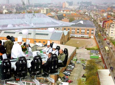 “Dinner in the Sky” is a unique and a rather bizarre breathtaking experience taking place on a suspended table for 22 guests hovering 50 meters above the ground by a crane. Each guest is strapped down to a roller coaster like seat then hoisted up for one chilling, perhaps frightening exciting experience of their life. If you happen to be one of the lucky participants in this event, I’d hope you’re not the type that drops their utensils much. I’d also wonder about the bird’s flying around or those bathroom breaks. Otherwise, get your camera, strap on your shoes, add a strap to your cell phone, and enjoy!
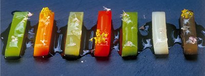 I just finished watching an amazing documentary on the travel channel called "Decoding Ferran Adria" which had me drooling over the visually magical and breathtaking experimental dishes served at the world famous restaurant elBulli and chef/owner Ferran Adria. The mind-blowing combinations in ingredients and creative presentations are truly original and an experience like no other. To make reservations for this restaurant is said to be over a year long. elBulli is only open for 6 months out of the year as it takes the other 6 months to travel, experiment, and come up with new concepts each year in their ultra modern controversial innovation foodlab. Not only do the dishes taste sensational, but the process in creating and manipulating the ingredients to their extreme is astonishing! One fact that I loved was that Adrias lab team consist of a Chemist, Industrial Designer(wohooo!), and several other chefs.
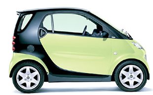 Wohhooo!! The SMART car has finally been approved to make its way to America around 2008. I'd still prefer the Nissan Cube or Chapo, perhaps a Mini, but the SMART will do just fine.

"Tim Knowles creates drawings independent of his own hand, using elaborate apparatus or time consuming practices. Interested in the process of drawing Knowles invents experimental and playful procedures to introduce chance and unpredictability into his work. Often he will employ and expose mans relationship to nature, in an ongoing series which will feature in the exhibition, Knowles attaches pens to the tips of branches of various trees; placing paper in front of them he allows the chance movement of the wind to dictate the composition of the final drawing. The artist surrenders final control of the work, questioning the authority of the artist whilst allowing the fundamental and primordial characteristics associated with drawing to be communicated."
Read more at Rokeygallery
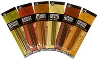 Heres a “Why didn’t I think of that” idea! Flavored Seasoned Skewers! Perhaps I’m just really hungry right now, but these sure sound tasty for a nice BBQ. I’m also the type that licks every savory taste off the stick usually. It’s about time something simple gave a kick of flavor into the middle of the meat!
 Business weeks annual IDEA awards for outstanding designs and innovations is out. They have 108 projects documented, some great, some stunning, some just ok in my mind. One that popped out for me was the Sushi Plate by Mint Inc. Take a browse at the winners here.
 So, I was shopping online for some Maharishi cloths I posted about, and ended up emailing the company to find out where I could get some of their goods. They ended up introducing me to a place called Bodega in Boston, which I had never heard of. I found out this high-end fashion store was somewhat hidden inside a soda machine, inside a thrifty little convient store, with no signs. So as you are probably thinking, bizzare right. Well, my first drive by, I saw a convient store, but thought nothinig of it, and went back home and just said another day. Well, today I was in the area again, and decided to go into the convient store. At first it was locked, but a stylish person came out to greet me and said they were closed, and I asked if I could just take a quick peek. "Sure, come on in." Ok.. I see some fritos, detergent, spam, toilet paper, some candy, and a soda machine.... If you dont mind hearing the surprise experience, continue here..
 Do you own an ipod? Do you have a case protecting it? If so, is it one of the hundreds of incredibly ugly cases out there? Now, my question to you is, why? Why buy a beautiful ipod and dress it up with an ugly case 24/7 ? Now I understand the idea of protecting it, but what I don't understand is if you are so proud of how beautiful it looks, why make it look even uglier with an ugly case at all times? Sure you can pull it out and be proud there's not a scratch on it, but how often do you actually do that? What happens if you just let your ipod get scratched up? Will it somehow get a nostalgic appearance? Will it get scratched up beyond usability? Or will you keep buying the new one that comes out each year. Do you buy covers for your cell phone, jewelry, camera, car, watch, shoes, laptop, etc? Sure for some, but the ipods created a phenomenon about protecting it. Sure it easily scratches..perhaps Apple did this on purpose so you'd buy the new ipod each year. Perhaps it's about value, but jewelry, cell phones, cameras, watches, cost $$. Take for example shoe($100+). The function is to protect your feet,(ipods to play music) but you also buy it for style, but your not going to wrap a plastic bag around it. Shoes wear, get dirty, get wet, get scratched, and you buy a new one eventually. I'm not saying you don't need a case, I'm just curious why else. Anyhow, just food for thought...
 I've always questioned if technology and electronics would become nostalgic, where electronics, laptops, cell phones, mp3 players would be kept for longer than say two years. In todays society, electronics are thrown away not only because they are behind in technology, but for their looks.(little dings here and there) I was reminded of this question when I saw this post here, about how a scratched up Sony camera actually looked cool, how it had a splendid patina look. In this rare case, a dinged up electronic actually had a good emotional response from someone, much like a beat up leather jacket, worn out ripped jeans, overly wrinkled fashionable shirts, a used baseball glove, a wooden old ladder, a dirty but huggable teddy bear, etc. As Russell Davies says in his post, "One of the things I hate about the design of most things, especially most electronic things, and definitely most automotive things, is they're all designed to be new. They're all at their best when you buy them and they get worse the second you remove them from the packaging." So, what's the solution to this, is there a need for nostalgic electronics, should electronics be made to have more meaning?... I'm not sure, it's just a thought. I use to think soft materials would add this meaningful value but from what I know, the only integrated soft electronic is this sleek porsche like vertu ascent phone for $5,000. It's strange how tons of people buy soft cases for their gadgets.... are consumers saying something companies are not realizing? ;)
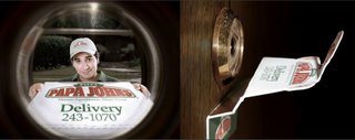 Here's a pretty clever little ad to slap onto a door. It's been a little minii trend to replace real objects with ads lately, but hey, it's grabbed my attention for the better for now.via frederiksamuel
 For the first time ever, the exclusive invite-only TED conference experience, which I've posted about several times, is launching TEDtalks which is a free video and audio series of some of the best TED speakers for everyone in the world to see and hear. TED is a journey of some of the most mind-provoking idea gatherings in the world which is limited to 1,000 people each year but is now spreading some their love through this new chapter. I'm extremely happy that TED decided to add this feature as every time I return from the TED conference I ramble for endless enthusiastic months to my friends about it. Attending TED is like no other conference and a heaven of ideas for anyone to experience. Though the speakers talks are only a portion of the magical safari, TEDtalks is a first step in sharing the real magic of captivating, igniting, and making real world changes that keeps this community so compelling. Go check it out, get inspired, and start spreading the idea virus! (Sir Ken Robinson on creativity is a must watch video!)
 If your an entrepreneur and missed my post "Entrepreneurialism: the new rock ‘n’ roll", then you must watch this great video presentation by Guy Kawasaki on his book "The Art of the Start". Who is he you might ask...don't ask, just watch, be amazed, get inspired, and google him later. Otherwise, read his post on the "Bozo Explosion"! This guy rocks!!! I'd love to have him on my team anyday!
 Have you ever wondered how to travel the entire world and get a company to pay for it all? Well, meet Matt Harding, a game developer that quit his job to travel the world for a bit of an adventure while filming himself doing a little dance in each location. Upon returning from his world safari, his video hit the infectious internet world and got in the hands of some corporate leaders who decided to pay and sponsor him to do it all over again and in different locations if not everywhere. If you have not seen this viral video see it here (2005), here (2006), or wherethehellismatt.com. Once you see this mesmerizing video you’ll understand why it’s hard not to watch Matt do his goofy dance in sooo many amazzzing locations. Matts dance reminds me of the Six Flags dancer which also stuck in my head for some time. This post is just a reminder that doing some of the darnest things on the net will score ya big much like the crazy christmas light house last year that got some crazy check for a Miller Lite commerical.
 These baby print shirts are way tooooo cute not to buy for your fashionably styling todlers. I'd wonder what my lifestyle would of been like if I rocked on these shirts as a kid. Anyhow, check out their site, get some sweet gear, and let your young ones get their pimp on! Buh yeah!
 Martin Laksman has a great set of illustrations, icons, characters, graphics, and logos at his website Laksman.com.ar. My particular favorites: freaky flo, cosos, eggs, egressados, consumerway, letterface, and many more. If your looking for some lively, colorful, fun, and spunky graphics, check out his website and get inspired.
 Talk about a HUGE umbrella! "The Big Umbrella is a big umbrella designed to shield a large group of people from the rain. A typical big umbrella can shield approximately 4 tightly squeezed people from the rain. ‘The Big Umbrella’ is twice as big (240 x 160 cm) as the biggest men’s umbrella found on the consumer market and can in turn potentially shield 16 people from the rain. "
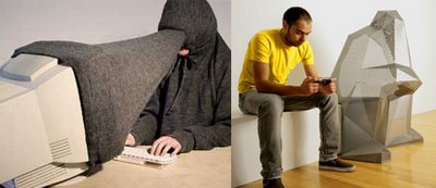 It’s amazing how technology has become an indispensable element in our everyday lives, but it’s also curious how it has introduced us to a series of gestures that are perhaps changing more than our intent. Pictured left is Private Public, a great series of objects that highlight the privacy we sacrifice when using mobile devices in public spaces, making visible a cone of privacy technology has brought to our public attention. Pictured right is a series of sculptures inspired by gestures formed by people using the PSP (Playstation Portable). Keyboards, mice, laptops, remotes, etc are all devices that have made us gesture in new ways. My favorite is probably the the awkward position designers plot their fingers on the keyboard at all times while using photoshop or illustrator. Another example is googles interface design. Anyhow, this is just a brief thought on how the things we design change and echo out past our intentions and expectations.via WMMNA
 Here’s another great ad that goes straight to the point and shows what the product does and how well. If only mr clean were everywhere in public spaces. I’m not sure if this ad is real, but it sures cuts to the point.
 “Shoot me if you can” is a fun urban game inspired by first person shooting video games. A gun is replaced by a phone camera, players wear bright labels with their numbers on them, players track down opponents, snap pictures, and SMS the opposing teams when they are shot. First team with shots of all the other team members wins! Different rules exist for variations in the game.I love it when creative uses in technology allow people to return to the physical landscape, though, anyone playing this game may seem like a krazy James Bond nut on the street with a bright barcode on their shirt. This game brings awareness to the mind-boggling abundance of cameras throughout our culture eveywhere we go. Whichever the case, I’d be curious to give this game a go if I can convince a dozen of my local friends to give it a run. Check out their webpage for more info!
 "Already beautiful, already essential, Doublewide legitimizes the elegance that already exists within the simple steel folding chair. A subtle change in proportion alters its character, subtly shifting typologies. It is now slightly more formal, more intimate. It moves from the meeting hall to the living room. What was a public banality to accomodate a singular person is grown to accept a couple in a more private setting."
 While in nyc I went down to St. Marks street to grab some grub with some friends at Kenka, a spunky, fun, and wildly popular japanese restaurant streaming with a vibrant crowd of college students and visitors curious about the oddly colorful and punk like scene, though I think the whistling grandmother logo and beaver-like red eyed mascot really caught my curious attention. I'd been to a like place nearby, Yakitori Taisho, right down the street, but thought I'd give this find a try. The wait to get in took some time, but it was worth evey second. As for the restaurant, the staff was jazzy, the environment was fun and spontaneous, the bizarre menu was full of delicious and surprising items, and the prices just rocked! A bowl of edamame for $1, Seaweed salad $2, japaneses pancake $4, smoked salmon $5, sapporo beer for $1.50!!! The best part was their dessert. Instead of the traditional mint, or chocolate candies, they give you a little bucket of red suger to toss into their cotton candy machine at their entrance. You toss it in, grab a chopstick, and spin it till you have a fluff of carnival like candy to munch on. Kenkas is a great place to kick it with friends and munch down on some fast, hot, and tasty japanese food. If your in nyc, give it a try!
 Bastardino is a prickly little pooch in the Cactus Friends series by artist Simone Legno and his art brand tokidoki, which is a pretty krazy page(launch the flash page). Others in the series include the pink and spunky Sabochan and a very green Sandy!